Adding more depth to modal View Controller Transitions in iOS


The default modal view controller transition in iOS is something that I've become a little annoyed of. If the view controllers (the one being presented, and the one presenting the modal view) both have vivid bright colours, the flat dimension to the transition makes it a little difficult to sense the anticipation in it's appearance moving up from the bottom.
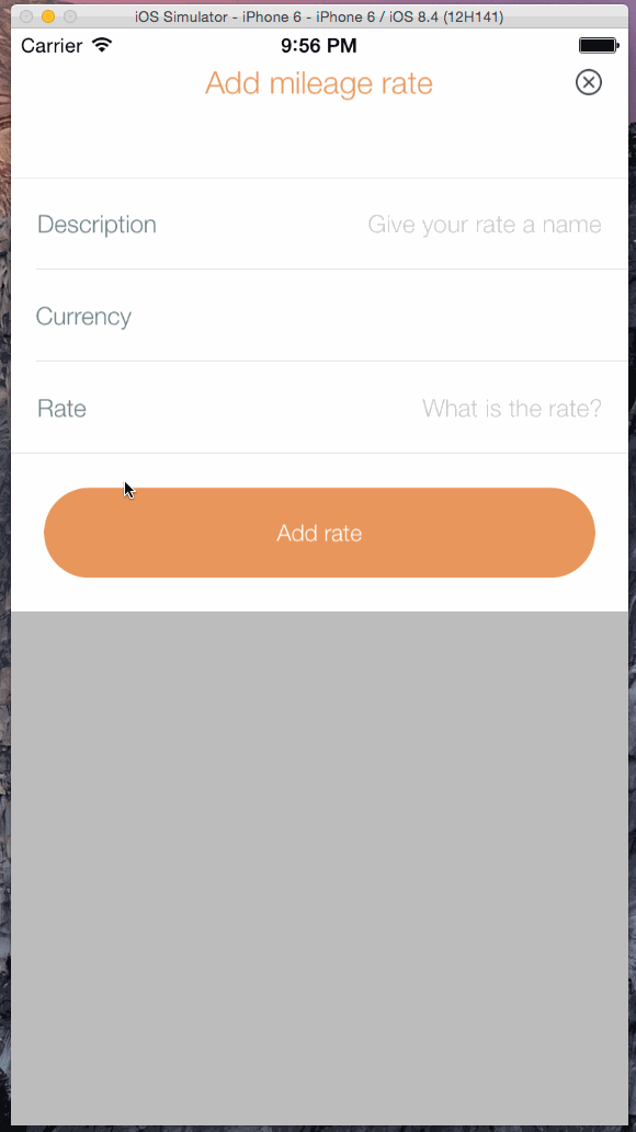
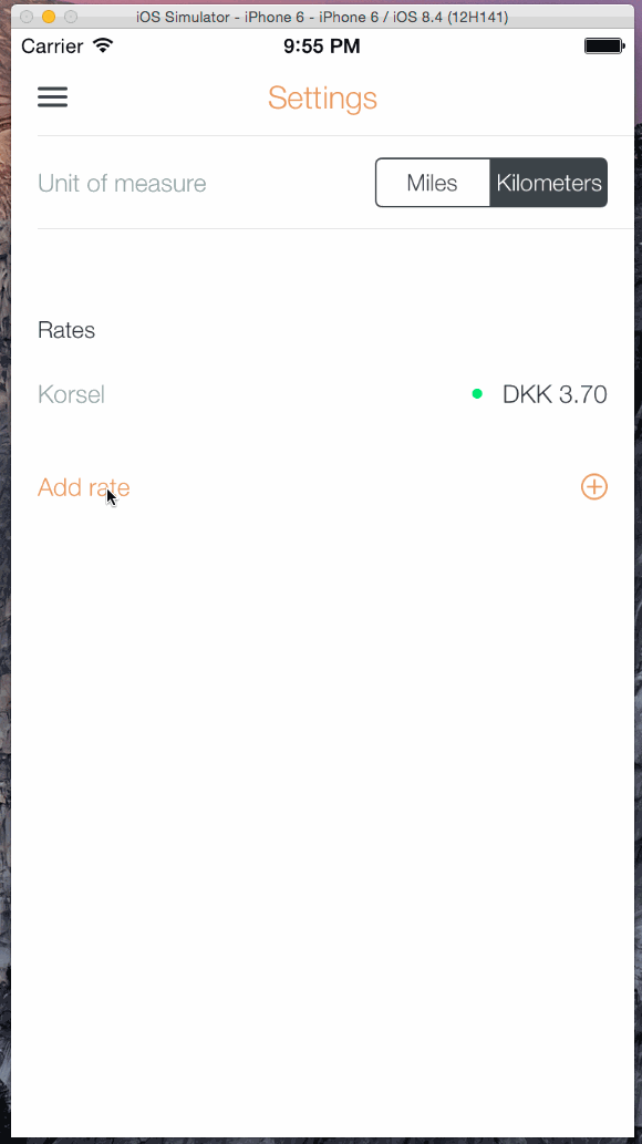
The modal is being presented without much change to the original (presenting) view. Here it isn't even as bad as when the presented modal view covers the entire height of the screen.
Something I see more and more in apps today, is to apply a subtle scale transform to the presenting view controller to make it just a tiny bit smaller.
Twitter is doing this when you tap the create new tweet button.
I also applied it to my app used as the example before, and in my opinion it adds depth to the transition that makes a subtle but still improved difference that makes everything a little more exciting.
Most of all when your tap immediately transforms the presenting view, you know your tap had an effect and something is about to happen.
As a starting point for the transition above, I used the LGSemiModalNavController repo on GitHub and customized it to animate the presented modal all the way to the top, instead of snapping to the bottom (leaving space at the top transparent).