A simple cheat sheet for Seaborn Data Visualization

Just gonna put this out here, courtesy of Kaggle's Data Visualization course.
It is a super simple description of the different plots you can do with Seaborn, simply divided into the type of story you're trying to tell.
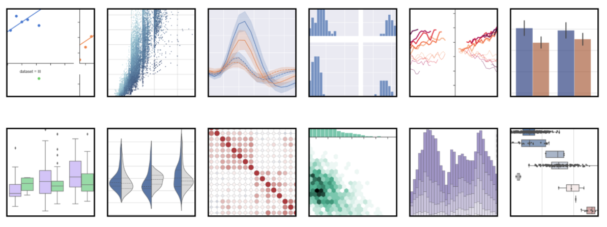
There's even an awesome photo!
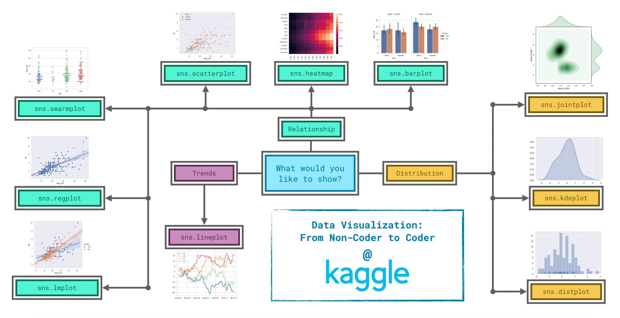
Trends - A trend is defined as a pattern of change.
sns.lineplot- Line charts are best to show trends over a period of time, and multiple lines can be used to show trends in more than one group.
Relationship - There are many different chart types that you can use to understand relationships between variables in your data.
sns.barplot- Bar charts are useful for comparing quantities corresponding to different groups.sns.heatmap- Heatmaps can be used to find color-coded patterns in tables of numbers.sns.scatterplot- Scatter plots show the relationship between two continuous variables; if color-coded, we can also show the relationship with a third categorical variable.sns.regplot- Including a regression line in the scatter plot makes it easier to see any linear relationship between two variables.sns.lmplot- This command is useful for drawing multiple regression lines, if the scatter plot contains multiple, color-coded groups.sns.swarmplot- Categorical scatter plots show the relationship between a continuous variable and a categorical variable.
Distribution - We visualize distributions to show the possible values that we can expect to see in a variable, along with how likely they are.
sns.distplot- Histograms show the distribution of a single numerical variable.sns.kdeplot- KDE plots (or 2D KDE plots) show an estimated, smooth distribution of a single numerical variable (or two numerical variables).sns.jointplot- This command is useful for simultaneously displaying a 2D KDE plot with the corresponding KDE plots for each individual variable.